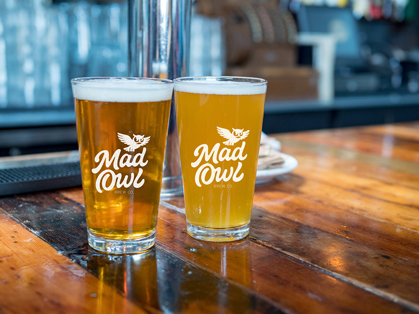
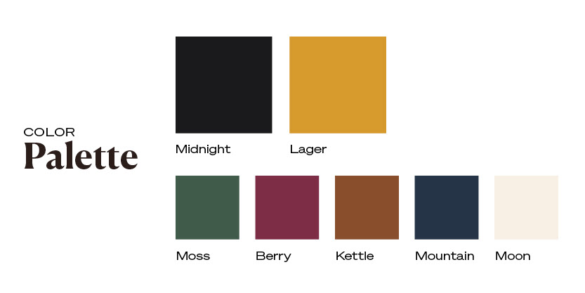
Mad Owl Brewing Company draws inspiration from the surrounding landscape and wildlife of southeast Tennessee, shaping a brand that feels playful, handcrafted, and rooted. The colors blend deep, night-inspired tones with warm amber and earthy accents, reflecting both the natural environment and the rich color of craft beer, while pops of color capture the creativity of small-batch brewing.
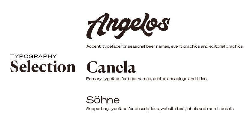
The typography uses expressive lettering to for personality and movement, while supporting typefaces provide clarity and flexibility across menus, packaging, and signage. Together, these elements create a visual language that feels bold, approachable, and distinctly local, allowing Mad Owl Brewing Company to reflect the curiosity and character of its community.
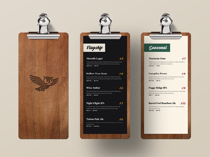
Flagship and Seasonal Beer Menu Design with Custom Clipboards
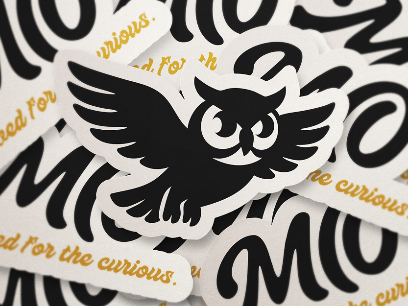
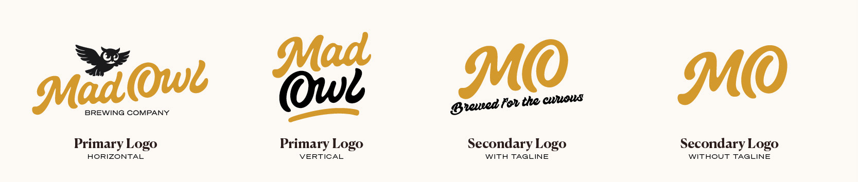
Logo and Logo Mark Sticker Designs
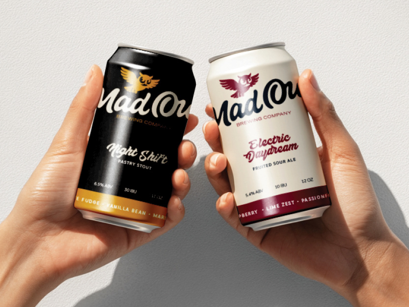
Custom Beer Can Design for Flagship and Returning Seasonals
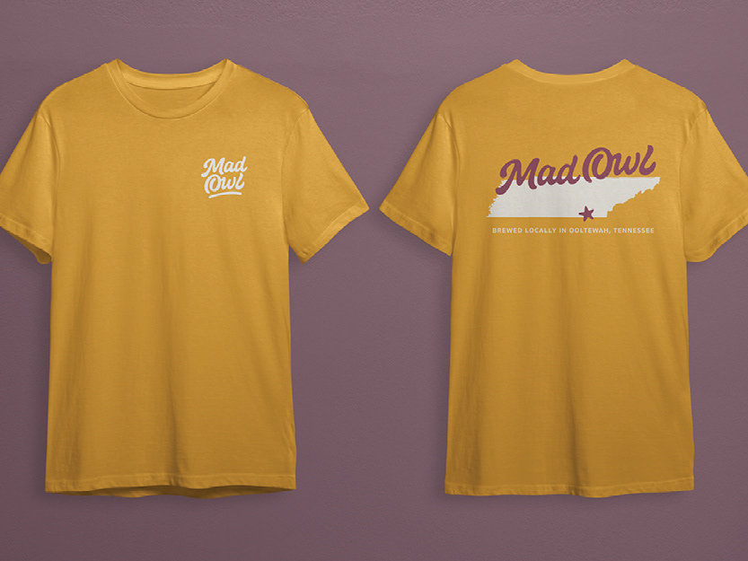
T-Shirt Design featuring Illustration of Tennessee
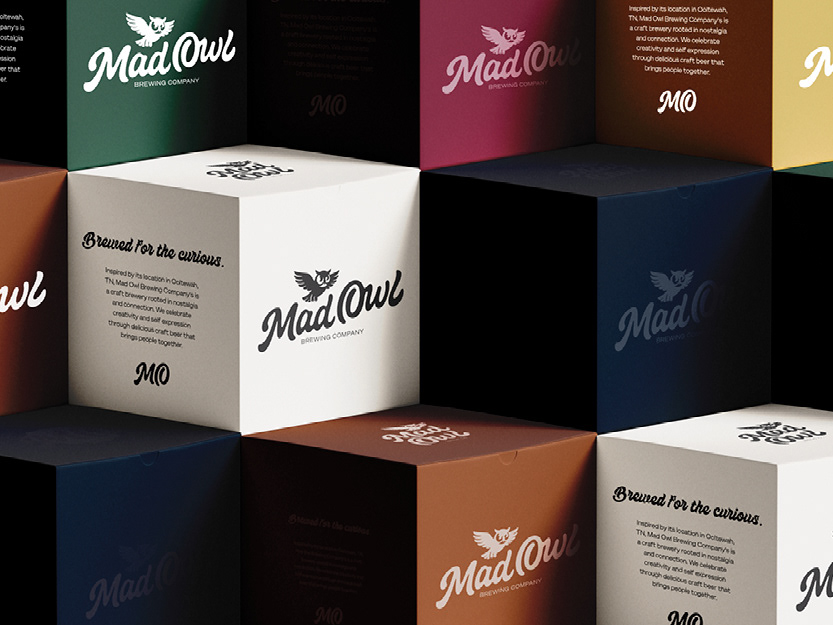
Custom Packaging for Retail with Brand Story